| Author | Comment | |
|
1. 1 Oct 2010 03:56 |
|
|
mum23
 |
Thanks to hanging for passing the baton for this challenge to me!
I’ve been reading about complementary colours recently. From primary school days, I remembered that complementary colours are those that are opposite on the colour wheel; red and green, orange and blue, and yellow and purple are the three sets of opposite colours.
I’ve found it fascinating to learn that not only do complementary colours appear to intensify each other when they are used next to each other, but that artists also mix or underpaint with a complementary colour when they want to tone a bright colour down.
For this challenge, I would like you to draw pictures which strongly feature complementary colours. Your pictures may use some other colours, but try to use the pairs of colours together so that they dominate your pictures.
Here are a few examples to illustrate (thank you to the artists – I hope nobody minds me using their pictures for this) :
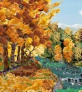
Red and green
By marky
 http://www.thinkdraw.com/picture.php?pictureId=119830 http://www.thinkdraw.com/picture.php?pictureId=119830
by cdaws12
 http://www.thinkdraw.com/picture.php?pictureId=119793 http://www.thinkdraw.com/picture.php?pictureId=119793
by maggiemae
 http://www.thinkdraw.com/picture.php?pictureId=119744 http://www.thinkdraw.com/picture.php?pictureId=119744
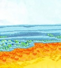
Orange and blue
By pollyesther
 http://www.thinkdraw.com/picture.php?pictureId=83600 http://www.thinkdraw.com/picture.php?pictureId=83600
by Luna
 http://www.thinkdraw.com/picture.php?pictureId=52899 http://www.thinkdraw.com/picture.php?pictureId=52899
Yellow and purple
By polenta
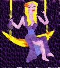 http://www.thinkdraw.com/picture.php?pictureId=119727 http://www.thinkdraw.com/picture.php?pictureId=119727
By denee
http://www.thinkdraw.com/picture.php?pictureId=119723
by maggiemae
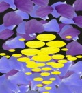 http://www.thinkdraw.com/picture.php?pictureId=119820 http://www.thinkdraw.com/picture.php?pictureId=119820
Have fun! Do pictures, doodles, patterns or whatever takes your fancy! The challenge will run to 9 October and I’ll pass the baton the following day.
... and if anybody else would like to expand on the subject and theory of complementary colours, please feel free to impart your wisdom here too!
|
|
2. 1 Oct 2010 05:22 |
|
|
mum23
|
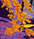
Here's one to start the ball rolling...
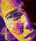 http://www.thinkdraw.com/picture.php?pictureId=119837 http://www.thinkdraw.com/picture.php?pictureId=119837
This is from a photograph I took of my younger son a few months ago. He was sitting at the table having breakfast. The sun had just risen and was casting almost horizontal shadows across his face. I took a series of photos; in most of them he was laughing and hamming it up for the camera, but I loved this thoughtful one!
He was most amused that I wanted to draw it in purple and yellow... "I'm not purple and yellow, mum!" and he went off laughing to himself. When he came back into the room with his sister some time later, they were still laughing about me trying to draw him in those colours!
Then he saw the picture. His expression was priceless; it actually brought tears to my eyes. It was written all over his face - he was just rapt! After he stood looking for a few moments, he ran over and hugged me. He was obviously very touched, and so was I. It was a beautiful moment!
|
|
3. 1 Oct 2010 08:05 |
|
|
hanging
 |
Mum, this is stunning! I didn't know about the complementary colours and it surely makes the difference in drawing by knowing it.
I feel so excited to draw and see the difference using the colours!!!
|
|
4. 1 Oct 2010 11:56 |
|
|
Normal
 |
You mentioned the 3 obvious sets of complementary colors, using the 3 each primary & secondary ones. The tertiary colors also have their opposites, or complements. Examples are red-violet to yellow-green, or green-blue (aqua!) to red-orange.
|
|
5. 1 Oct 2010 14:21 |
|
|
stevedover1965
 |
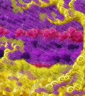
 http://www.thinkdraw.com/picture.php?pictureId=107211 http://www.thinkdraw.com/picture.php?pictureId=107211
I did this picture using contrasting colours
|
|
6. 1 Oct 2010 14:59 |
|
|
hanging
|
I just had to try this once...!
yellow/purple (purple didn't come out as I wished though. Lol.
 http://www.thinkdraw.com/picture.php?pictureId=119911 http://www.thinkdraw.com/picture.php?pictureId=119911
orange/blue
 http://www.thinkdraw.com/picture.php?pictureId=119913 http://www.thinkdraw.com/picture.php?pictureId=119913
red/green
 http://www.thinkdraw.com/picture.php?pictureId=119914 http://www.thinkdraw.com/picture.php?pictureId=119914
|
|
7. 1 Oct 2010 16:05 |
|
|
five
 |
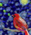
 http://www.thinkdraw.com/picture.php?pictureId=119915 http://www.thinkdraw.com/picture.php?pictureId=119915
|
|
8. 1 Oct 2010 16:06 |
|
|
five
|
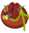
orange/yellow and blue on fruit
 http://www.thinkdraw.com/picture.php?pictureId=119922 http://www.thinkdraw.com/picture.php?pictureId=119922
|
|
9. 1 Oct 2010 17:09 |
|
|
polenta
 |
 http://www.thinkdraw.com/picture.php?pictureId=11985 http://www.thinkdraw.com/picture.php?pictureId=11985
|
|
10. 1 Oct 2010 17:11 |
|
|
polenta
|
Sorry I meant this one
 http://www.thinkdraw.com/picture.php?pictureId=119857 http://www.thinkdraw.com/picture.php?pictureId=119857
|
|
11. 1 Oct 2010 17:21 |
|
|
mum23
|
It's great to see some entries already!
Normal, thank you for adding your comment about the other complementary colours. I suppose every colour has an opposite on the colour wheel, doesn't it? The primary and secondary colours are just the easiest to recognise and describe!
Thank you for your 'older' picture, Steve. I did look around for examples... if anybody else has 'old' pictures that would suit this challenge, please add them too, although only new pics will be eligible for the baton!
Hanging, I love your experiments! The blue/orange one illustrates perfectly another attribute of complementary colours. The warm (in this case, orange and red) colours almost jump out of the picture at you, while the cool (blue) recedes into the background. Keep having fun with it!
Thanks for your pictures too, five! The way you've used all three combinations throughout the picture in 'grumpy' is wonderful... and a good lesson in how to use the colours when doing a realistic picture. With 'rush in' the blue is more muted (grey-blue), but still very effective against the orange.
Once you start to look at the way colours work together, you see them everywhere... bright red flowers against green foliage, ochre desert sands against blue skies, and a multitude of flowers which are purple and yellow.
Keep the pics coming in, and have fun!
|
|
12. 1 Oct 2010 17:22 |
|
|
mum23
|
Thanks polenta... you posted yours while I was typing! That red cape against the green bull(!) works brilliantly!
|
|
13. 1 Oct 2010 18:11 |
|
|
five
|
 http://www.thinkdraw.com/picture.php?pictureId=119931 http://www.thinkdraw.com/picture.php?pictureId=119931
|
|
14. 1 Oct 2010 18:51 |
|
|
five
|
When thinking of compliments in terms of red/ green, orange/blue, and yellow/purple, remember those are quite broad descriptors (the "blue" that compliments "orange" tends toward turquoise, not darker blue (the compliment of which is more yellow than orange), most purples find a better compliment in greens (the yellowish side of green); etc.
The compliment of a color is its after image -- stare at the color (a little hard on the eyes with the computer, so more for looking at colors not on the computer screen) and then move your eyes to a white wall; the after image will flash the exact compliment to the color you stared at. You can also put the color up against a light grey paper and the edge between the color and the grey paper will flash the complimentary color.
With color, it's best to build a "feel" than to get bogged down in color theory shorthand. You can actually create more than one color wheel (not a bad color exercise) depending on whether your looking at additive or subtractive color (light or pigment) and through one color model or another color model. This is not to dismiss the basic color wheel we learn as kids; it's useful as a short hand. Just pointing out shortcomings.
There's a pretty good Wikapedia article on it: http://en.wikipedia.org/wiki/Complementary_color
|
|
15. 2 Oct 2010 00:36 |
|
|
clorophilla
 |
I think the right link is the following: http://en.wikipedia.org/wiki/Complementary_colours
I remember a very enlighting debate on this matter, in an old topic, with link to many useful palettes: do anyone remember where it was?
|
|
16. 2 Oct 2010 00:52 |
|
|
clorophilla
|
Not sure that those old pics fit - I tend to use a lot of colours!
this may be?  http://www.thinkdraw.com/picture.php?pictureId=116326 http://www.thinkdraw.com/picture.php?pictureId=116326
green and red:
 http://www.thinkdraw.com/picture.php?pictureId=114660 http://www.thinkdraw.com/picture.php?pictureId=114660
 http://www.thinkdraw.com/picture.php?pictureId=113594 http://www.thinkdraw.com/picture.php?pictureId=113594
 http://www.thinkdraw.com/picture.php?pictureId=109582 http://www.thinkdraw.com/picture.php?pictureId=109582
 http://www.thinkdraw.com/picture.php?pictureId=100995 http://www.thinkdraw.com/picture.php?pictureId=100995
 http://www.thinkdraw.com/picture.php?pictureId=99742 http://www.thinkdraw.com/picture.php?pictureId=99742
 http://www.thinkdraw.com/picture.php?pictureId=97119 http://www.thinkdraw.com/picture.php?pictureId=97119
 http://www.thinkdraw.com/picture.php?pictureId=71806 http://www.thinkdraw.com/picture.php?pictureId=71806
blue and orange
 http://www.thinkdraw.com/picture.php?pictureId=109773 http://www.thinkdraw.com/picture.php?pictureId=109773
 http://www.thinkdraw.com/picture.php?pictureId=101138 http://www.thinkdraw.com/picture.php?pictureId=101138
purple and yellow:
 http://www.thinkdraw.com/picture.php?pictureId=99414 http://www.thinkdraw.com/picture.php?pictureId=99414
 http://www.thinkdraw.com/picture.php?pictureId=71699 http://www.thinkdraw.com/picture.php?pictureId=71699
all three matching:
 http://www.thinkdraw.com/picture.php?pictureId=104097 http://www.thinkdraw.com/picture.php?pictureId=104097
|
|
17. 2 Oct 2010 00:53 |
|
|
clorophilla
|
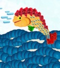
mmmh... the jumping fish should be in the orange/blue group
|
|
18. 2 Oct 2010 02:17 |
|
|
solange62
 |
Here two old of mine, just for fun...
 http://www.thinkdraw.com/picture.php?pictureId=117046 http://www.thinkdraw.com/picture.php?pictureId=117046
 http://www.thinkdraw.com/picture.php?pictureId=66531 http://www.thinkdraw.com/picture.php?pictureId=66531
|
|
19. 2 Oct 2010 03:12 |
|
|
clorophilla
|
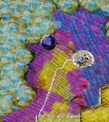
a new one
 http://www.thinkdraw.com/picture.php?pictureId=119952 http://www.thinkdraw.com/picture.php?pictureId=119952
|
|
20. 2 Oct 2010 07:14 |
|
|
polenta
|
I remember my mother saying to me:
-"Brown and green match. After all nature can't be wrong and a tree has these two colors."
Was she right?
|