| Author | Comment | |
|
21. 1 Aug 2009 20:50 |
|
|
matthew
 |
*** Here is a more advance lesson example...
http://www.thinkdraw.com/picture.php?pictureId=53800
|
|
22. 2 Aug 2009 03:05 |
|
|
anotherronism
 |
Folks: This may or may not be some of your problems on subtle coloring. Keep in mind that I'm actually colorblind. But I do know when things are different.
Wikipedia has a technical article on this at: http://en.wikipedia.org/wiki/Gamma_correction
I use PC's exclusively. I do videos and I use Photoshop a LOT. I was forced to understand some of this by necessity.
The PC world and the Mac world operate on two seperate gamma levels. This is basically a correction to brightness and color saturation.
If you produce a picture on a mac and give it to me on my uncorrected PC it will NOT look the same. It will be lower contrast, dull and comepletely non-vivid. The internet uses a standardized RedGreenBlue non-gamma-corrected color system.
When I first installed Photoshop on my PC it included a utility to correct my gamma values to a number of "standards" (TV, DVD video, VHS video, PC, Internet and Mac)
When I make a video I want black to be BLACK - not 98% grey.
I think it was Picasso who asked about not having the blues available that Matthew seemed to have.
Search the web. The utility that came with Photoshop to normalize my gamma correction values must exist as freeware or cheap utility software somewhere out there.
But Macs and PCs do NOT use the same value.
There is even a device called a Spider which hangs in front of your monitor and helps to calibrate what the computer thinks it's displaying with what you actually see (around $100US though.)
My thought would be that your web display gamma coupled with your standard Mac gamma coupled with Adobe Flash (which is what TD is made out of) are not calibrated so you're not seeing the colors on the drawing canvas that you're seeing on the displayed images.
I wish I could help you actually solve this but knowing where the problem lies might help you help yourself.
Oh - you could also go out and get a PC 
|
|
23. 2 Aug 2009 18:24 |
|
|
a4e4ka
 |
About sky and water, Matthew: How you make it 3D? Deep?
Rivers, ponds, lakes, etc. Mine have 1,5 dimentions...
|
|
24. 3 Aug 2009 10:20 |
|
|
matthew
|
This is quite a good question... & i will answer as soon as I can... May need to use multiple pics & discussion for this one...
Sorry for the delay...
|
|
25. 3 Aug 2009 10:40 |
|
|
matthew
|
OH!!! What a great example of using the blue flower pedals to make a pic...
This pic was done by ARW65... You should REALLY take the time to check this out...
 http://www.thinkdraw.com/picture.php?pictureId=53933 http://www.thinkdraw.com/picture.php?pictureId=53933
|
|
26. 3 Aug 2009 15:44 |
|
|
polenta
 |
The techniques Arw used in this pic are incredible. In fact they are easy once someone has used them, but I guess this is the first time someone has done something like this. Many have used silhouettes. She has used the white background but later worked inside the silhouette leaving a little white background as a "pencil line" (incredible!!!) .... I feel I will have to use this technique some day......even though the result will not be like hers of course. A REAL INNOVATION, A REAL CREATION
|
|
27. 5 Aug 2009 19:08 |
|
|
matthew
|
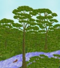
Ok... Sky...Water & depth... I will try to answer some of that using pics I had previously done with some added explination...
#1... The sky in & of it's self is just a background... it has no depth at all... What we place on the background will give the viewer the illusion of depth as it is with all parts of our picture... I mean... We are painting on a flat surface, so what you want to do is play tricks on the eye...
*** Picture #1 ***
http://www.thinkdraw.com/picture.php?pictureId=54417
This is not the best pic in the world, but lets look at it... On our blue sky, we added two clouds using the white tip of blue flower petals closely layered together... In the forground I added some trees that raise into our sky... One tree is drawn larger than the other to give the illusion that it is closer... That adds to the depth...
***Picture #2***
 http://www.thinkdraw.com/picture.php?pictureId=54330 http://www.thinkdraw.com/picture.php?pictureId=54330
In this picture, I actually used TD's existing background & just drew on top of it... Again, my main focus in creating the depth are trees... There are 3 main trees in this pic in 3 different sizes making them look closer or farther away... I then added random twigs & leaves as "fill in" trees...
What I really like about this example is that the largest tree appears to be on the near side of the river... Because of that, the river also receives it's depth from the trees...
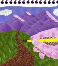
***Picture #3***
http://www.thinkdraw.com/picture.php?pictureId=51740
in this pic, you can clearly see the FLAT sky background draw 1st... The depth is created here by 3 main focus pieces... The VERY large tree branch fronting the picture, The road that tapers down smaller to look as if it gets further away as you go down it, and the tiny house in the background...
***Picture #4***
http://www.thinkdraw.com/picture.php?pictureId=36751
Here is an older picture of mine... it is an example of poor depth... the river looks semi-flat... The bends & turns give it some depth, but it needed something in the forground on the near side of the river in order to make it pop... A tree, animal or something like that would have worked nicely here...
***Picture #5***
http://www.thinkdraw.com/picture.php?pictureId=35710
In this pic, i used an odd green sky & quite liked it, but see how deep a picture can become just by putting something large in the foreground... There are 3 main parts to this drawing... The sky & trees took a long time to draw, but they are just the background to the 3rd part which is the bird & vines...
***Picture #6***
http://www.thinkdraw.com/picture.php?pictureId=30634
here is a tough one... I used very similar color for my sky & water... So to create division, I used purple mountains... I defined the sky using clouds & the water using waves... The depth was achieved with small mountains (far away) close shore (mid range) and you guessed it... A BIG tree in the foreground (near)...
***Picture #7***
 http://www.thinkdraw.com/picture.php?pictureId=25181 http://www.thinkdraw.com/picture.php?pictureId=25181
Just a neat pic showing more ideas to create depth...
***Picture #8***
http://www.thinkdraw.com/picture.php?pictureId=20920
Again showing something large in the foreground can make a big difference...
***Picture #9***
http://www.thinkdraw.com/picture.php?pictureId=18529
Love the little deer in this one... but see how size plays tricks on the eyes to create depth... even the little green patch in the lower left helps my cause...
|
|
28. 5 Aug 2009 19:20 |
|
|
polenta
|
Thanks so much Matthew for revealing all these secrets so generously. I wonder how much your fees will be.
I might invite you to eat a typical Uruguayan "asado".
|
|
29. 5 Aug 2009 19:27 |
|
|
matthew
|
WHAT DID YOU JUST CALL ME??? lol... Just kidding.... I am glad you like my lessons... I am enjoying sharing...
|
|
30. 6 Aug 2009 04:19 |
|
|
polenta
|
Matthew, do you think this is the technique ARW taught us?
 http://www.thinkdraw.com/picture.php?pictureId=54530 http://www.thinkdraw.com/picture.php?pictureId=54530
|
|
31. 6 Aug 2009 06:52 |
|
|
matthew
|
Yes & no...
You did a great job with the outline & color change of your shape & the way you did it worked perfectly in candy...
ARW didn't use candy pieces, she used blue flower petals so she didn't have to change the color of her patern...
So you took her technique & went a step further by doing it in candy to make it your own...
BRAVO...
|
|
32. 7 Aug 2009 02:06 |
|
|
polenta
|
Yes, Matthew you may be right but I was totally unaware of it. Maybe it's what we all do, we take from others and then we go a step further. By the way, I think ARW herself doesn't know she "invented" a technique.
|
|
33. 7 Aug 2009 11:12 |
|
|
brigsis
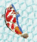 |
Hi Matthew , I made a pic kind of like #4. And its my profile pic ...
I think I made better depth on the botom half. Its my best in candy and I'm wondering what I should have done differently in the top half to give it more POW.=) It looks semi flat but the botom isn't . Do you ever make pics like that? =,
|
|
34. 7 Aug 2009 12:42 |
|
|
matthew
|
Brigsis, @ 1st glance I notice that the Lower right Ice is shaded down the left edge... I think if you put that same shading across the upper piece of ice you would get a bit better effect...
Thanks for your question...
|
|
35. 8 Aug 2009 09:59 |
|
|
brigsis
|
Thanks Matthew
|
|
36. 8 Aug 2009 11:36 |
|
|
matthew
|
Ok... Next lesson will be on ANIMATION...
A lot of people are having difficulty slowing down their animated pics... I have a couple of fixes & will cover those soon, but I must leave for right now...
I just put this topic out there to see if anyone else would like to discuss ways they have found to slow the animation down... Someone just might cover my couple of points & be my "substitute teacher"...
|
|
37. 8 Aug 2009 12:41 |
|
|
belladonnis
 |
Matthew
I just left a response on another topic but I would like to leave it here also.
If any one comments on one of my pics and they see something that I could do to improve on please suggest it!
|
|
38. 8 Aug 2009 13:02 |
|
|
belladonnis
|
Can you save more that 1 draft ?
|
|
39. 8 Aug 2009 13:54 |
|
|
matthew
|
You can save 1 draft in each medium...
|
|
40. 8 Aug 2009 14:13 |
|
|
belladonnis
|
Thanks.
|