| Author | Comment | |
|
41. 5 May 2010 03:01 |
|
|
chelydra
 |
"...the vanishing point is actually located in the viewer's own eyeball; it's created, and placed in its location, by the point of view..."
I just noticed this doesn't seem to make much sense because of my use of 'located' and 'location' as if the POV were placing itself in the eyeball. What I meant was that the eyeball's own movements send the vanishing point hither and yon — onto the far horizon if you're looking straight ahead of you, or in the sky if you're looking up, or deep into the earth is you're looking down.
|
|
42. 5 May 2010 03:09 |
|
|
chelydra
|
You'll find a very brief clip of a movie about Arthur B Carles here:
http://www.jonnyres.net/
|
|
43. 5 May 2010 06:24 |
|
|
puzzler
 |
Oh dear, I only popped in to have a look at what the new challenge was and now I have a headache! I think I will need a degree in art to attempt anything - but - I may be back, when I've worked it out.
|
|
44. 5 May 2010 07:06 |
|
|
clorophilla
 |
Dear Chelydra, dear Qsilv,
I admitt that I gave up to read this tread at the second page. I don't think to be totally dumb and I have some artistic background (although I have not a specific academic background in art, I stemmed from dozen of generations of artists and I studied a little stuffs for myself).
Anyway, from your exploration of art, space, cubism, mildcubism, structure and perspective I finally understood... nothing.
Whean I read your first message it seems to me quite to have grasped the concept, then when I kept reading I began more and more confused. I saw the exemples too, and began confused again. Actually, now I can say that mild cubism is all possible art and all the exact contrary of it...
Now I feel myself so lacking of background, culture, art awareness, artistic sensitivity and basically I feel myself drop out the glittering tower of art knowledge...
Please, Chelydra and Qsilv, If you want this challenge to be a challenge to draw and not a challenge to understand (that could end up to a brilliant but solitary pas-a-deux), could you re-write and re-define in a few words what this challing is about? Keeping in mind that not only many great artists on TD have not the cultural background to understand you, but also some of them (me included) are not English motherlanguage and so have another barrier to overcome?
Thank, thank, thank you!
|
|
45. 5 May 2010 07:18 |
|
|
Shanley
 |
-Sneaking in on my tippy-toes...
Clorophilla...it's probably best to take a look at the painters named in the beginning...
Chelydra...Clorophilla is right...you're making this very interesting...but also complicated...
..Sneaking out before I get cubes thrown at me  - -
Eager to go back to previous page and catch up with the reading.
|
|
46. 5 May 2010 13:14 |
|
|
chelydra
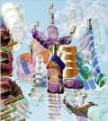
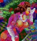
|
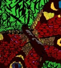
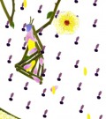
Oh dear. I was afraid this would happen! That's why I said please start responding to my very first message (with pictures) before reading further!
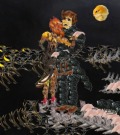
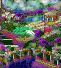
Qsliv is innocent in this! I'm the main culprit, and five is my willing accomplice (but I dragged/tempted her into it so she can't be blamed either). The words are unimportant compared to the pictures I offered as examples. As Shanley suggested, the first artists I listed will give you better idea of what the challenge is about than any number of words possibly can.
|
|
47. 5 May 2010 14:09 |
|
|
chelydra
|
Jacques Villon, of all the artists I listed, is for me the essence of Mild Cubism… these samples of his work show EXACTLY what I have in mind with this challenge. Don’t try to copy or imitate what he did here. Just look at it for a while.
http://jama.ama-assn.org/cgi/content/extract/280/3/210
http://www.amorosart.com/artwork-villon-jacques_villon_ou_l_art_glorieux-4606-en.html
http://jama.ama-assn.org/cgi/content/extract/279/17/1330
http://picasaweb.google.com/lh/photo/N6N6cb8uE1ZCBopaynoLUw
_______________
This is by someone named Angel Zarraga, from 1917:
http://www.pr.gov.br/mon/exposicoes/latitudes/angel.jpg
|
|
48. 5 May 2010 14:26 |
|
|
chelydra
|
John Marin — the one of the Woolworth Building is by far the best example here:
http://album.udn.com/waysfu/photo/3447235?o=view
http://www.artknowledgenews.com/2009-12-12-00-23-59-wadsworth-atheneum-to-feature-exhibition-o f-its-modern-american-works-on-paper.html
http://album.udn.com/waysfu/photo/3447249?o=odr
http://album.udn.com/waysfu/photo/3447249?o=odr
http://album.udn.com/waysfu/photo/3447245?o=odr
http://album.udn.com/waysfu/photo/3447234?o=odr#photoanc
|
|
49. 5 May 2010 14:28 |
|
|
chelydra
|
Damn — the link to the Woolworth Building is the only one of the above five that isn't working!!! I'll try to find it somewhere else.
|
|
50. 5 May 2010 14:30 |
|
|
chelydra
|
Try this one:
http://www.chinaoilpainting.com/china%20oil%20painting/picture-39794-Marin,%20John-Woolworth%2 0Building.html
|
|
51. 5 May 2010 14:35 |
|
|
chelydra
|
Message 50 above shows Marin's Woolworth Building watercolor in all its glory. Marin offers a kind of enhanced depth perception, in which all the "empty" space is actively contributing to this magnificent illusion.
|
|
52. 5 May 2010 14:40 |
|
|
chelydra
|
Some quite lovely examples of Mild Cubism have appeared in danila's gallery. Here are three, but there may be more on the way.
 http://www.thinkdraw.com/picture.php?pictureId=103511 http://www.thinkdraw.com/picture.php?pictureId=103511
 http://www.thinkdraw.com/picture.php?pictureId=103478 http://www.thinkdraw.com/picture.php?pictureId=103478
 http://www.thinkdraw.com/picture.php?pictureId=103436 http://www.thinkdraw.com/picture.php?pictureId=103436
|
|
53. 5 May 2010 14:55 |
|
|
Qsilv
 |
ok... Q also sneaks back in... grins... and offers--
Q's 2 SIMPLIFIED VERSIONS of Chelydra's Challenge:
1. ***DRAW A FEW THINGS THAT INVOLVE THINKING ABOUT DEPTH AND THE PICTURE PLANE***
2. ***DRAW THINGS THAT SHOW US HOW YOU SEE THE WHOLE ITEM (OR PERSON OR SPACE), NOT JUST THE PART FACING US***
(Please feel completely free to ignore all our swirling words -- EXCEPT TO AMUSE YOURSELVES -- and then just stick out your tongues at us!)
;>
|
|
54. 5 May 2010 15:01 |
|
|
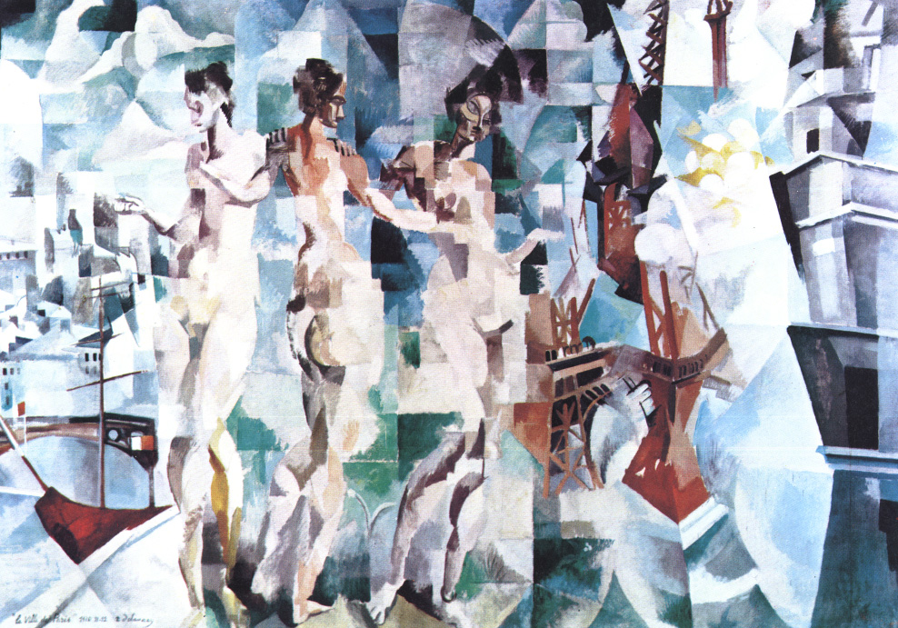
chelydra
|
Here's a real gem from Robert Dalaunay:
http://www.turntablebluelight.com/images/misc/City%20of%20Paris.jpg
I don't love these the way I love Villon and Marin, but there're certainly classic examples of Mild Cubism:
Roger de la Fresnaye:
http://michellebloom.files.wordpress.com/2010/02/p1050054.jpg ("The Conquest of the Air")
http://www.artknowledgenews.com/SeaFair.html
http://www.picturalissim.com/art_fauvism.htm (This one is incorrectly labelled 'Fauvism' on its web page.)
http://www.metmuseum.org/toah/works-of-art/1991.397
Sonia Delaunay-Turk (married to Robert D.):
http://michellebloom.files.wordpress.com/2010/02/p1050046.jpg ("Portuguese Market")
Scroll down to see another from her:
http://www.turntablebluelight.com/2009/04/back_to_futurism.html
|
|
55. 5 May 2010 15:10 |
|
|
chelydra
|
For anyone who wants to see more about Sonia Delaunay:
http://www.obit-mag.com/articles/the-colorful-life-of-sonia-delaunay
Hi Q! I hope that helps, but I'm afriad that what seems simple and straightforward to you may just look like more mystification & obscurity to anyone who isn't familiar with this 'picture plane' business. I hoping all these pictures I've been posting will make sense of it all. We'll see.
|
|
56. 5 May 2010 16:35 |
|
|
Qsilv
|
...should've reversed the order, so the simplest-straightforwardest was #1
and THEN sucker 'em along into the next easy stage with a vaguely arcane term, huh?
; P
|
|
57. 5 May 2010 18:11 |
|
|
Qsilv
|
fwiw, I've managed to find 3 out of all this mess that I actually like.... and, oddly, they're quite different from each other.
Sonia Delaunay's Prismes Électriques (1914) ..."geometrically depicting the colours simultaneously emanating from three electric light-bulbs in street-lamps" works for me, altho it's supposedly tainted by Futurism. Its patches of pure color would, I think, make a wonderful pieced quilt for a child.
http://www.turntablebluelight.com/2009/04/back_to_futurism.html
Roger de La Fresnaye's Artillery (1911) ...looks like a child's set of toy soldiers. Every shape still makes sense, even though reduced to simplest forms. The horse is a delight... love that jawline! And there's a rhythmic swirl... but it all feels strong and clean.
http://www.metmuseum.org/toah/works-of-art/1991.397
The 3rd one is gradually growing on me...
Robert Dalaunay's City of Paris ...this one is messier, but the repeated female figure is like a set of mannequins in a store window, and that effect is made even stronger by the shattered bits of images of things like a foot of the Eiffel Tower's ironwork,sections of stone building facades, the prow of a boat on the river... all set apart by splashes of white light, as if sunlight on those display windows were what was fragmenting what you're seeing. Very appropriate for Paris!
http://www.turntablebluelight.com/images/misc/City%20of%20Paris.jpg
|
|
58. 5 May 2010 19:47 |
|
|
five
 |
Cathedral
 http://www.thinkdraw.com/picture.php?pictureId=103560 http://www.thinkdraw.com/picture.php?pictureId=103560
|
|
59. 6 May 2010 03:11 |
|
|
clorophilla
|
I don't know if this may be mild cubism or mild tree-ism or what: it popped out of me...
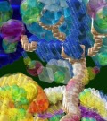 http://www.thinkdraw.com/picture.php?pictureId=103584 http://www.thinkdraw.com/picture.php?pictureId=103584
|
|
60. 6 May 2010 06:21 |
|
|
clorophilla
|
may be middle cubism and middle doodlism...
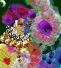 http://www.thinkdraw.com/picture.php?pictureId=103604 http://www.thinkdraw.com/picture.php?pictureId=103604
|